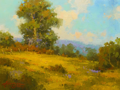
 Autumn's First Kiss, 9X12 oil on linen panel
Now that the blanket has covered us here in Minnesota with all the subtlety of a freight train slamming into the side of a mountain, I am here painting in the studio much more. It's a good time to review the plein air studies I did last year, and see if there are any of them from which I might like to work.
Here is a painting that I did by taking one of my plein air studies and painting over it. The original study, titled "Wildflower Hill", had many things about it that I liked. It was a success in my mind, as far as it went, which wasn't far enough. It was a painting which needed more. Here it is as I posted it last summer.
And though I liked it, I felt that it could be a much better painting with a few simple changes. As I saw it, there were two things to be addressed. The first was the depth of the composition. As I stood on site and did this painting, this is the way the actual landscape was. But when I took a more critical look at it, I wasn't comfortable with the fact that the foreground, middleground and background were so layered and separate. There was nothing leading your eye around the painting. One of the challenges we face as plein air painters is to take what nature gives us and translate it into a two dimensional work of art. One which leads us around the composition in a logical and pleasing manner. Most of the time, things need to be deconstructed and rearranged to get a successful painting. In the original, I really was trying to translate into paint, something as challenging (at least it's challenging to me) as a field of wildflowers, without getting drawn into the trap of painting individual flowers, instead of general shapes and correct values and edges. But what was missing were the elements which broke up the strong line of the hillside and lead you back into the trees. It was missing the depth. So, while repainting, I paid attention to breaking the line of the hillside by adding bushes which lead your eyes from foreground to background and back again. I also added a small post fence to the hilltop to help lead you around the painting. The smaller tree on the right side of the painting was pulled forward and does a nice job of breaking up the diagonal of the hill, and keeps your eye from sliding off the edge. It's job is also to add to the three dimensionality of the landscape. It's your invitation to step into the next layer. It keeps things from being flat.
I also reworked the patches of wild flowers into shapes which were of unequal size and shape, and into a more pleasing pattern. And was careful to paint the patch just under the large tree brighter than the rest. In this way, I help to establish my focal point of the large tree.
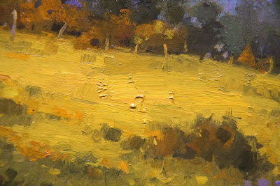
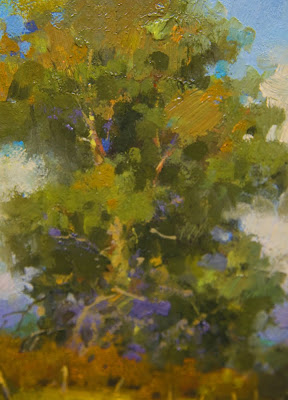
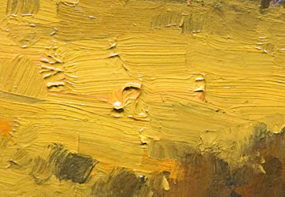
The second thing I wanted to do differently, was to paint it with more style. I want the person looking at the painting to know I had fun painting it. So I painted this one with a looser hand and more style. So here are a few detail photos to show some of the brushwork.

_____________________________________________

_____________________________________________

Thanks for looking, Steve


4 comments:
Very insightful. It looks great too.
Interesting contrast between the two. I like them both but the new version has a more expansive feel and seems to breathe more. Amazing how these subtle changes alter the perception of the piece. Thanks for sharing. I always look forward to your posts. Regards, /Lee
i think you have a great control over your palette 1 great tones 1
Thanks for the rationale behind the painting process, Steve. Funny how revising in the studio can have the effect of making a plein air piece look even more fresh. Your lush brushstrokes and harmonious color palette combine to make beautiful art!
Post a Comment