Tuesday, July 20, 2010

"Paint the Parks" Show Awards Announced


Hi Everyone,
Today the awards were announced for Paint America's 2010 "Paint the Parks" Competition and Show. My entry, "Dawn Over Tsegi Overlook" was given the Western Regional Award. This national competition is open to paintings of our National Parks. For the competition, the country is broken down into three regions. The region I competed in was region 2 which includes Texas, Oklahoma, New Mexico, Arizona, Nevada, Utah and California, as well as Hawaii. I'm truly honored to receive this award, since the skill level of the artists participating is so very high. Honestly, I would have been thrilled to just have been included in the show. This is a touring show and will be traveling to many cities throughout the United States in the next year. You can go to their website at www.paintamerica.org to view the show.

Tuesday, July 13, 2010

PORTRAIT OF A MOUNTAIN MAN

Free Trapper, 30X30 oil/stretched linen


Hi Everybody,
I've been wanting to do this painting for some time now. This is a simple portrait of a free trapper. During the fur trade era, the western mountains were over run with a rare breed of men who were looking to make their fortunes by trapping animals which were in great demand back east. By far, the fur that was most in demand was beaver. Most of these men were content to leave their civilized world behind to live by their wits in a decidedly hostile environment. Many started their training by working for the fur companies like the Rocky Mountain Fur Company, but a few moved on to be their own boss and master.

Keith Walters in his wonderful, information filled book, The Book of the Free Trapper, wrote this in his introduction:

'When John Colter left the enlistment of Lewis and Clark and began an amazing wilderness odyssey, a breed of men unsurpassed in bravery and skill was born. It was the breed of man who would roam the Rocky Mountains in search of beaver for the next 40 years. It was the breed of men known as the Free Trappers; the Mountain Men.
While the land was still virgin and unpeopled, the free trapper, bound by none, lived, loved, and ended a very misunderstood life. Labeled as crazy, outlaw, and forsaken for their wayward lives, the mountain men were the freest men ever t0 walk this land.
An attempt to explain the reasoning for any man exchanging a secure life for a life filled with constant danger, extreme loneliness, and no financial gain is an exercise in futility. Perhaps this was the reason for the misunderstanding of the mountain men. The reason a man would choose a life that would probably be his death can only be understood as a feeling, a sort of enchantment cast by the Rocky Mountains upon a handful of men predestined to roam as mountain men.'


Now, why Mr Walters chose to completely ignore the fact that the Native American roamed these mountains, and described the mountains as "unpeopled" is beyond me. But moving beyond that, he was right that these men lived by their wits and usually in a solitary existence. Once a year they would gather together to restock their supplies and make trades for their plews. These rendezvous, as they were known, were often the only time they would be with other human beings. It was a time for playing hard, as well as drinking hard.

I like to paint people who live by their wits and grit. The attitude is all important. His glance is wise and slightly defiant. With one hand on his rifle, and the other holding a willow hoop upon which is stretched a beaver pelt. He wears a capote (french for cape), a coat which is made from the wool trade blankets which were so prevalently available to the trappers. You can tell the quality and the cost of a trade blanket by looking at the number of stripes it has on it. Each stripe represents one beaver pelt required for the trade. The more stripes it has, the thicker and warmer it is. If you look at this trappers capote, you'll see three stripes, so this blanket cost him three beaver pelts.

I first became interested in mountain men after watching the great Sidney Pollack movie, Jeremiah Johnson, starring Robert Redford and Will Geer. Since then I've read just about every book on the history of the mountain man, and attended yearly rendezvous, which are gatherings of reenactors who try to reproduce, as accurately as possible, the ways, clothing and accoutrement of these hardy souls (although, I'm not one of the reenactors, and never dress up). It's where I met the model for this painting, a gregarious man known to everyone as Grampa Jim. Jim not only posed for me, but took a ridiculous amount of time answering my questions and tutoring me to correct my misconceptions. I am always grateful to anyone who is willing to share their hard earned knowledge.


Detail 1


Detail 2


On the technical side of this painting, these two close ups are just for the purpose of showing the broken colors and technique. Notice the reflected light in the close up of the shaded parts of his face. There are reds and greens and blues there. They are subtle and placed in the proper place and are not random. The greens reflect the pine tree, the reds reflect the light bouncing up from his coat and the blues are reflected from the sky. I've found that reflected light of those colors that surround an item is the single best way to paint believable light and turn a form to make it read as three dimensional. Reflected light is present almost everywhere. It bounces colors and influences all things around it. Be careful to not over do it, reflected light must never be as bright as the lit side of an object.


Detail 3

In this detail photo of the hand, if you look at the dark head wrap in the upper right corner, you'll see that the bright red of his coat is reflected up onto it. The red of his coat is also glowing a bit into the dark area of the head wrap. Do this strategically to reinforce the idea of strong sunlight.

If you take a little time to look at how light works, and consistently add it to your paintings, you will go a long way to improving your paintings.


Thanks for visiting! Steve

Friday, July 2, 2010

Racing the Wind


Racing the Wind, 24X30, oil on linen, ©2010 Steve Atkinson


Hi Everybody,
this scene has so many of the elements of western art that I love. First are the riders , which are coming directly at the viewers. Second is the dusty atmosphere. The riders are trying their best to stay ahead of the dust devil, which seems to be chasing them. The dust keeps the edges of everything soft. The third thing I like to challenge myself to paint, is the backlit subject. The way it keeps the shadow element values very close, while it lights up the edges of these things leaves no room for error.

Detail


One more thing about this painting that I enjoyed, is that its set in one of my favorite places in the world, Canyon de Chelly.


Thursday, July 1, 2010

View of Yellowstone Falls

View of Yellowstone Falls, 12X9 oil/canvas panel


Hi Everybody,

I've been finishing up some larger pieces for Trailside's Western Classics show in Jackson, Wy later in the Summer, which I'll be posting here in the next couple of days. But I needed a break from staring at the same couple of feet of canvas, so I did this quick painting. Painting loose was just the thing I needed to recharge my batteries. Start to finish it was about two hours. Just as if I had painted it on site and not cooped up in the studio.

Friday, May 28, 2010

Dawn at Tsegi Overlook

Dawn at Tsegi Overlook
Canyon de Chelly
16X40, oil/stretched linen

©2010


Hi Everybody,

This is my latest painting, still wet even. You don't need to go down into Canyon de Chelly to get some truly incredible views. Tsegi Overlook is an incredible vista any time of day, but it's in the early morning that it truly sings. This is the perfect spot to see atmospheric perspective at work.

Wednesday, May 26, 2010

First String, finished version


Hi Everybody,

I finally got to finish "First String", and wanted to make sure I posted it. I've been working on several other larger paintings in the mean time, but needed to have a little time and distance before I came back to this one. It always helps me to take a break from a painting, turn it to the wall, and come back to it with a fresh eye (that is, if you have the time, and deadlines don't require you to get it to the gallery). Problems that plagued me originally, or things that were wrong that I hadn't even noticed before, jump out at me and are much easier to address now.


First String, 24X30 oil/linen


First String will be included in Trailside Galleries' "Salute to Summer" show in June, 2010 in Jackson, Wyoming.


Thanks for looking, Steve

Friday, April 30, 2010

DUST AND THUNDER


Revised final painting, where I closed up the crack
along the front of the skull. Now it's not
 so distracting, and you see a beautiful skull
instead of a skull that has a big crack in it.


Dust and Thunder, 30X40 oil on stretched linen


Greetings!
My latest painting is called "Dust and Thunder". I find that I don't paint many still life's, just because I don't find that the traditional subject matter of flowers or fruit interesting. But I could look at a scenes like this forever. A painting with history or a deeper meaning, and yet is simple at it's very heart. In this scene, just a Navajo blanket, a lariat and a buffalo skull. It's the whole history of the west in one scene.


sketch for Dust and Thunder


This painting will be included in Trailside's upcoming "Salute to Summer" show at their Jackson, Wyoming location. I'm planning on having 4 new paintings to be included in the show that kicks off the season in the Jackson Hole area in Wyoming. The tourist season starts the Memorial Day weekend. It's almost like someone fires a starting gun in the air, and the people and buses start streaming in. If you've not been to Wyoming in general or Jackson specifically, try to get there. It's one of the most beautiful places in the West.

Wednesday, April 28, 2010

MARIAH

MARIAH, 9X12 oil on canvas ©2010


Greetings!
I will be posting a 30X40 painting in the next day or so, but in the mean time, I did a small landscape painting for the "Salute to Summer" show opening in June at the Jackson Wyoming Trailside Gallery. I love how cloud cover can quickly come in and cover the peaks of mountains. It's what happened the last time I visited the Tetons in Wyoming. In the distance you could see that it was clearing and wouldn't be long till the sun was back. It was a very windy day, so I named it the name of the wind, the same as the old song of the same name. Total painting time, 3 1/2 hours.

When I first started painting landscapes, it would take me days to produce one of these. As usual, I was getting lost in the details, instead of concentrating on the light effect, which is the essence of so many successful landscapes. I would get lost in painting the pine trees, being a slave to my reference, instead of using my photos as a jumping off point. Now I paint my areas in as general shapes, puzzle pieces which fit into each other, leaving the details until the effect was there already. Decide wher your focal point is and let the other areas in your painting play seconds to it. I wanted the focal point of this piece to be the area highlighted in detail #3 below. It has the areas of biggest contrast, and most detail. Everything else should support it, not compete with it. Don't kill a painting with extraneous details!


I get a lot of positive feedback on the close up details I post. So, here are some close ups of some of the more interesting passages.....


Detail 1


Detail 2


Detail 3


Hope you find this post helpful and interesting. Thanks for checking in!! --Steve

Sunday, April 18, 2010

First String Daily Demo, Day 5

Hi Everybody,
Today is "Paint a Cowboy" day. Time to get the rest of the canvas covered. That means painting in the shirt, jeans, boot and hands.


The shirt is in as well as the hands and part of the jeans. Like in the rest of the photo, I've simplified the folds in the shirt. The things I'm concentrating on for the shirt is getting the proper values in the right places. And getting in the light effect. This means adding colors that the photos don't usually contain. As you probably know, photos are great for giving us details that (my mind at least) we have a hard time retaining, or an even harder time making up. And though, the computer monitor is better at getting the colors as close to the original as we can, it still is only as good as you can tweak it. And you can only tweak it as good as you understand what happens with light. It's why I paint on location whenever I can. Nothing is better at teaching you the laws of light. I've never really mentioned another reason to paint outside. Willingness to publicly fail. I find that it's a very humbling experience to paint on location. Nothing, and I mean Nothing, draws people to you like setting up a tripod and paint box. People who would normally never dream of talking to perfect strangers, feel completely comfortable walking up to an artist and starting up a conversation. I've found that the law of crappy attraction applies, at least for me, while I'm painting out. This means that people will be attracted to your easel only when you are struggling with a painting, and come up at the worst time. People never seem to even see me when I'm working on a painting that's going well. That will keep anyone's ego waaaay down. So, back to the painting at hand.... now I'm working on painting in the light effect.


Here's a detailed view of the shirt which has a good representation of the warms and cools in both the light and shadow areas. Since the light areas have a warm light source, most of the lights are warm.... yellows, oranges and such. But it's important to put in some grays and blues here and there to make the effect more believable. I keep the warms an cools close in value and the human eye accepts the temp changes. Lots of reflected light in the shadow areas, especially where the reflected light is bouncing off the shirt itself.


The jeans go in next. The thing I spent the most time doing here is painting the top of the jeans more blue, and transitioning the pant leg to have more dust down at the bottom. So it ends up being warmer down at the boot. Two reasons I'm doing this, even though the reference doesn't have this. It makes the scene more believable, since the cowboy should have more dust on his pants down by his boots, since there is so much blowing dust. And it keeps him from looking like he's been pasted into the scene. Also is doesn't draw your eye down to the foot, and keeps it at the focal point, where it belongs.

The shadow areas have a nice warm reflected light bouncing onto the leg and really helps to turn the edge. I'm also keeping the edges softer in these areas. This also turns the edge and keeps your eye moving.


Here's the complete figure painted in. The canvas now is completely covered.


The painting at the end of day 5. I forgot to mention that I also went back into the foreground dirt and added a nice thick area of paint to bring more excitement to the painting. The thicker areas of paint are usually the first things people see when they look at a painting. But that's usually one of the last things I paint.


Only now that the entire canvas has paint covering it, can I begin the process of refinement. Now I can begin to adjust and balance the values which are too weak or strong, warm or cool, hard or soft edges. This is always my favorite part of a painting. This will make or break it's success.


I darken the shadow area of the horse's breast and bring it's value up to where it belongs. I also start to work on the lead ropes, softening edges and refining lights and darks. In the next couple of days I will be concentrating on adjusting any of these trouble areas. Also it's time to start perfecting the anatomy of the musculature of the horses legs and hooves. Finding the balance between detail and simplification. I will also be concentrating on getting the fence and gate finished, as well as adding the background details. Lots to do, but it really is the fun part.

Now I wait for a couple of days till the surface of the thicker paint dries. Right now it's in that weird tacky stage and can't be worked on till the entire surface dries. Then I'll bring the paint back to it's true colors by coating the surface, but more on that in the next installment. Needing to let the painting dry is why I work on several paintings at once. See you in a few days...

Wednesday, April 14, 2010

First String Daily Demo, Day 4


Hi Everybody,
Time to move onto the dogs and main figure. I don't always wait till the end to do the main figure, but it just naturally flowed that way on this painting. The rest of the figures will have everything to do with how I paint the cowboy. Painting the others first will keep me from painting him too tightly. Yep, you can probably see a theme developing here, with me always talking about keeping it loose. That's because my tendency is to go directly into painting the details and getting lost in the weeds. By keeping it loose and waiting till the end to selectively add the details, I'm able to make adjustments and paint a more artistic picture. One that focuses your eye to the exact spot on which I wish it to land.


First Dog laid in. Not the perfect face or head, but close enough for now. I will come back and tweak it later, but all the info is there and I can move on to the next dog.


Second border collie laid in. It was very important to me that the back of it's body was obscured by a veil if drifting dust. Right now it's purely about getting to dog to sit back and be one of the last figures you see.


I'm happier with this guy's face and I won't have to do much fiddling with it. Once you get it right leave it alone. Remember, there ain't no undo button like there is on the computer. I've lost more good painting by messing with a passage than anything else. If it's right, leave it alone!


Here it is with the dogs in place. I still have a couple of hours, so I go ahead and start on the head of the cowboy.


Keep your shadow areas separate from your light areas. Remember to add your reflected light, but don't let it compete with the light side. You'll notice that I began to put in the shirt, but I keep the lay in in the shadows, always comparing this shadow value to the surrounding areas, like the face and the horse which borders his sleeve.


Here's a close up detail of the face. Nothing is labored over. Be clean in your value changes and remember that the reflected light which is bouncing off the underside of his chin is a version of what is causing it, in this case, his light purple/ blue shirt. It might look a bit funny now, but will be right when I paint in the light side of his shirt.

See you tomorrow!

Sunday, April 11, 2010

First String Daily Painting Demo, Day 2+3

Hi Everybody, day 2 begins and I'm ready to start in on the horses. The first horse I will do is the white one on the far right side. For some reason, I had a senior moment and did not photograph the end of the first day with the two horses in on the right side, so just know that at the end of the second day, I had worked in the red metal swinging gate on the right side and two horses on the right side.


Here's what the first horse looked like when it was laid in. At this point, all the values were pretty close to what I wanted them to be. It's really important to me to get the reflected light bouncing from the ground onto it's undercarriage. Almost everything you paint will have reflected light. The stronger the light source, the stronger the reflected light. Remember your secondary light is light that's just what its sounds like, light that's being reflected from another object onto your subject's shadowed area. It's never as light as the directly lit area. It needs to read like it's still in the shadows, so be careful with your values here.


Closeup view of the first horse. Keep it simple. Don't put in every detail there is. Be selective, strive for accuracy of shapes, value, and color temp. You can always make adjustments later, but be as accurate as you can without putting in too much detail. Details don't make a successful painting! Mood, story, values, composition and edges do! For me, the painters who are most successful are the ones able to paint accurately, yet with a looseness. I love paintings where it looked like the painter had a good time painting it.

Another thing about this stage is: I know I'm going to be obscuring the hooves and lower legs of the horses with dust, so I don't waste a lot of time putting in details which will just be obscured later. I know I will be dry brushing the dust over the hoofs, coronets and pasterns because it has a very believable look to it when it's done this way.


The head and neck of the second horse after the lay in. Again, accuracy of shape, value and temps. One of the things that helps make the horse more believable (or any object, really), is making sure to put in warms and cools. You can see on the forehead and nose that I put in purple grays along with the yellows and oranges.

Here's a more detailed view of what I'm talking about. You can see how the warms and cools work together here to make a believable painting. It also shows how very little detail was painted in. No individual hairs were needed to convey the idea that he has a mane.


Here's where I left it at at the end of day three. All three of the horses are laid in. The faces, heads and necks have the most detail. Saddles and tack have less and the legs/hooves have the least, but more than they will have when the painting will be finished.

Thanks for looking! Steve

Thursday, April 8, 2010

'FIRST STRING" DAILY PAINTING DEMO

Hi Everybody,
I'm now settled into my new studio and have begun painting again. For this entry, I thought I would post another painting demo. It's been quite a while since I did a demo, and I feel like it's time. This time around the painting is called "First String" I'll take you from the initial concept pencil and include as much of my thought process as I can include without putting you to sleep.
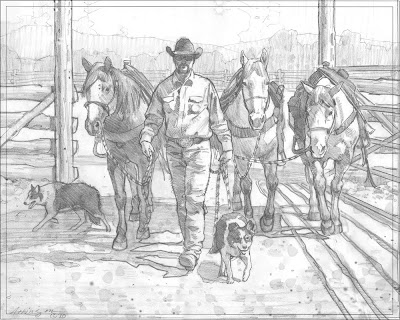


Here is the pencil I did to work out any kinks, and save me time on the easel. If I don't work out all the holes I have in my reference, I can spend a lot of time repainting areas, so, for me, it's time well spent up front. The main image of the horses and cowboy is from some reference I took at the Tucson Rodeo in February. The lighting was less than I deal and I had an idea to add some backlit dust to knock back the background and help with the focal point. The dogs were added to help with the concept and to highlight the partnership between cowboys, horses, and dogs. Besides, I like painting dogs. Hey, it's a weakness. The middle ground with the gate, fence and treelined background were invented using separate reference photos. Just enough of a background to give it a general place. It's not that important to the painting, so I don't overdo it with detail. When I put them all together, I find out if the drawing has enough merit to carry it into a painting. I originally was going to do this painting 18X24", but I decided that it would look better and have more impact at a larger size. So, the finished painting will be done at 24X30".


__________________
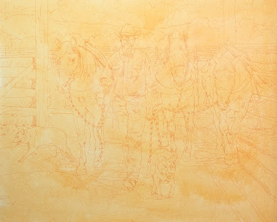


Once I'm happy with the pencil, I transfer the image to the toned canvas. I tone all my canvases using a color I think will work if I let little areas unpainted and poking through. For this painting, since it will be infused with dust, I used a thin wash of yellow ochre. When I do plein air work I usually use a thin wash of Cadmium Orange. It just depends on the painting.
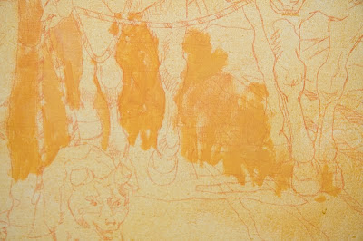


This is a close-up of the very beginning of the painting process. I included this photo to show you how thin the paint is at this point. If you look at the paint that's being loosely applied, you can still faintly see the drawing through the wash. The paint isn't like watercolor wash, it's thicker than that, but still thin enough to work over. This is important to me since I will be working over it while it's still wet.


My painting set up is pretty simple. The painting is on my easel. I've mounted my 30" display monitor on a wall swing arm mount. This allows me to work horizontally, or rotate my monitor 90º and view it vertically, which makes for a much larger viewing area if the piece I'm working on is in portrait mode. On my monitor you can see my original photo, to which I've added the dogs in Photoshop. Also, I've got a photo of western fencing I'm using as generic reference. The lighting isn't right, but it lets me see the details of how it's constructed. And, I keep my sketch taped to the wall, to refer to when I need to see how I worked things out, just in case.
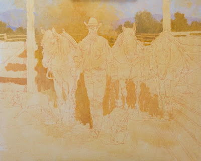


I'm only at the start of the lay in, but I wanted to show how simply it begins. Right now all I'm concerned with is getting the value relationships close. This block in goes pretty quickly, since I am not putting in any detail. In fact, I don't always put in the lightest lights or darkest darks. I don't know what needs to be detailed now, and if I put them in, I run the risk of making it too busy. The simpler the start the better. I can always add more later, but it's harder to take it out.
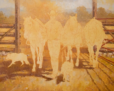


Here is where I ended up at the end of the first day. Simple shapes, simple values and most of my time was spent thinking about supporting the figures once they started to go in. The dust cloud behind my figures is going in well and I think will highlight the focal point and add the dramatic lighting I want. I'm not just painting the reference photo exactly like it is, I'm adding a light effect to make it a painting and have it create a mood. This painting will be all about attitude and confidence. Almost like gladiators walking into the coliseum, ready to do battle.

Round 2 will come tomorrow....

Saturday, February 6, 2010

Blogger confessional...

Hotcakes and Syrup, 12X16, oil on linen panel ©2010


Forgive me painters, for I have sinned, it's been one month since my last post.

OK OK, I've never been accused of great time management, and I don't think anyone ever will. I'm closing on the sale of our Minnesota house next week (yay, it sold), and the movers come at the end of the week to load everything into a big truck to take it to Arizona. So, needless to say, I've been busy packing and showing the house and selling our extra "stuff". But I did want to do a quick post of a painting I just finished for the Catholic Charities fundraiser "Men Who Cook" coming up in April. I did this painting as a donation for them to auction off. Since the fundraiser has a food theme, I thought it would be fun to do a big stack of steaming blueberry pancakes being doused with maple syrup. A little looser in style than I usually work, I like it that way. Since I was an illustrator for a package design firm, I've illustrated lots of food over the years (raspberries are my least favorite food to do), and I'm comfortable doing it. So this was a natural fit for me and I had a blast doing something different from what I have been doing lately.

Thanks for looking, Steve

Monday, January 11, 2010

New direction for a study

Autumn's First Kiss, 9X12 oil on linen panel

Now that the blanket has covered us here in Minnesota with all the subtlety of a freight train slamming into the side of a mountain, I am here painting in the studio much more. It's a good time to review the plein air studies I did last year, and see if there are any of them from which I might like to work.

Here is a painting that I did by taking one of my plein air studies and painting over it. The original study, titled "Wildflower Hill", had many things about it that I liked. It was a success in my mind, as far as it went, which wasn't far enough. It was a painting which needed more. Here it is as I posted it last summer.


Wildflower Hill, 9X12 oil on painting panel


And though I liked it, I felt that it could be a much better painting with a few simple changes. As I saw it, there were two things to be addressed. The first was the depth of the composition. As I stood on site and did this painting, this is the way the actual landscape was. But when I took a more critical look at it, I wasn't comfortable with the fact that the foreground, middleground and background were so layered and separate. There was nothing leading your eye around the painting. One of the challenges we face as plein air painters is to take what nature gives us and translate it into a two dimensional work of art. One which leads us around the composition in a logical and pleasing manner. Most of the time, things need to be deconstructed and rearranged to get a successful painting. In the original, I really was trying to translate into paint, something as challenging (at least it's challenging to me) as a field of wildflowers, without getting drawn into the trap of painting individual flowers, instead of general shapes and correct values and edges. But what was missing were the elements which broke up the strong line of the hillside and lead you back into the trees. It was missing the depth. So, while repainting, I paid attention to breaking the line of the hillside by adding bushes which lead your eyes from foreground to background and back again. I also added a small post fence to the hilltop to help lead you around the painting. The smaller tree on the right side of the painting was pulled forward and does a nice job of breaking up the diagonal of the hill, and keeps your eye from sliding off the edge. It's job is also to add to the three dimensionality of the landscape. It's your invitation to step into the next layer. It keeps things from being flat.

I also reworked the patches of wild flowers into shapes which were of unequal size and shape, and into a more pleasing pattern. And was careful to paint the patch just under the large tree brighter than the rest. In this way, I help to establish my focal point of the large tree.

The second thing I wanted to do differently, was to paint it with more style. I want the person looking at the painting to know I had fun painting it. So I painted this one with a looser hand and more style. So here are a few detail photos to show some of the brushwork.


_____________________________________________


_____________________________________________


Thanks for looking, Steve

Sunday, January 3, 2010

There's One in Every Bunch

Hi All,
I've been busy in the studio working on some new medium sized paintings for the show deadlines coming up, as well as the spring gallery season. The Oil Painters of America National Show deadline is fast approaching. This painting was to be my entry, but paintings need to be available for sale in that show. I am blessed to have some wonderful collectors, and when I was approached by one who wanted to add it to their collection, I wasn't about the say no. So, I'm working on another piece for that show. However, I wanted to post this painting and share some of my thoughts and processes on how I painted it.

There's One In Every Bunch, 24X30, oil on linen

Firstly, let's talk about paintings and photo reference. I have lots and lots if ideas rolling around in my head for paintings I would like to do. Sometimes the ideas for the painting comes first and I take my reference to fit the idea I have. Sometimes I get an idea for a painting from the reference I've taken and fit the painting together from that. Sometimes I even get a name for a painting and develop the painting to fit the name. For this painting I had the idea and name first. I had the reference I needed for the bolting steer and chasing cowboy, though they came from different photos. The thing I needed was the setting for the painting. I wasn't happy with anything I had for this piece and waited till I found the perfect scene. That happened when I went to Canyon de Chelly and along with Rusty Jones, stumbled into this wash. The layout and lighting was perfect. It didn't take long to put the scene together. I love the S curve of the composition, with the dust of trail taking you back into the gully to where it opens up to the basin in the background.

I always try to do some drawings for any areas in a painting that have changes that need to be worked out ahead of time. Honestly, taking a little time now can save you a whole lot of painting time later on. In this case, I had to add sleeves onto the shirt of the cowboy. I took the additional photos for the sleeves I needed and worked out any problems in this charcoal sketch. In this sketch I was considering adding a vest to the rider. In the end, I decided against it.
Horse and rider study


These pencils are done quickly and I don't labor over them. That way I don't spend a lot of time adding information I don't need to work out. It doesn't need to be photographic for me to use it, it's just a tool for gathering information. Drawing is fun, but in the end, it's about doing a painting, not drawing.

Once the painting information is gathered, I draw the image onto the canvas and paint. I start with large shapes and cover the canvas as quickly as I can while still being accurate with the values. I can't stress this enough. Color temps can be tweaked later and the details added last, but I try not to add these details until I'm happy with the values, composition and color temps. It's the things you notice first in a painting that you paint in last.

Cowboy detail


Detail


Dust detail #1


Dust detail #2


One additional note.... if you are painting from photos, do not be a slave to the colors or values which you see. You need to adjust these things to work together into a cohesive scene. Photography is a wonderful tool, but it's just a tool. Your photos will always disappoint you when you get back to the studio. Your darks will become black holes, and your highlights will almost always be too light. But if you do your homework and spend some of your time painting in the field, you will be able to trust yourself to make corrections and adjustments when you need to. I know for me, that the trip I took last year to paint in the Canyon, helped me to be able to paint the colors I knew to be there, not the colors my camera recorded. I can't stress this enough. Thanks for taking the time to look at my latest work. My next post will follow me as I work a painting from start to finish.

taker easy, Steve